
Dolly Parton Issue (2019)

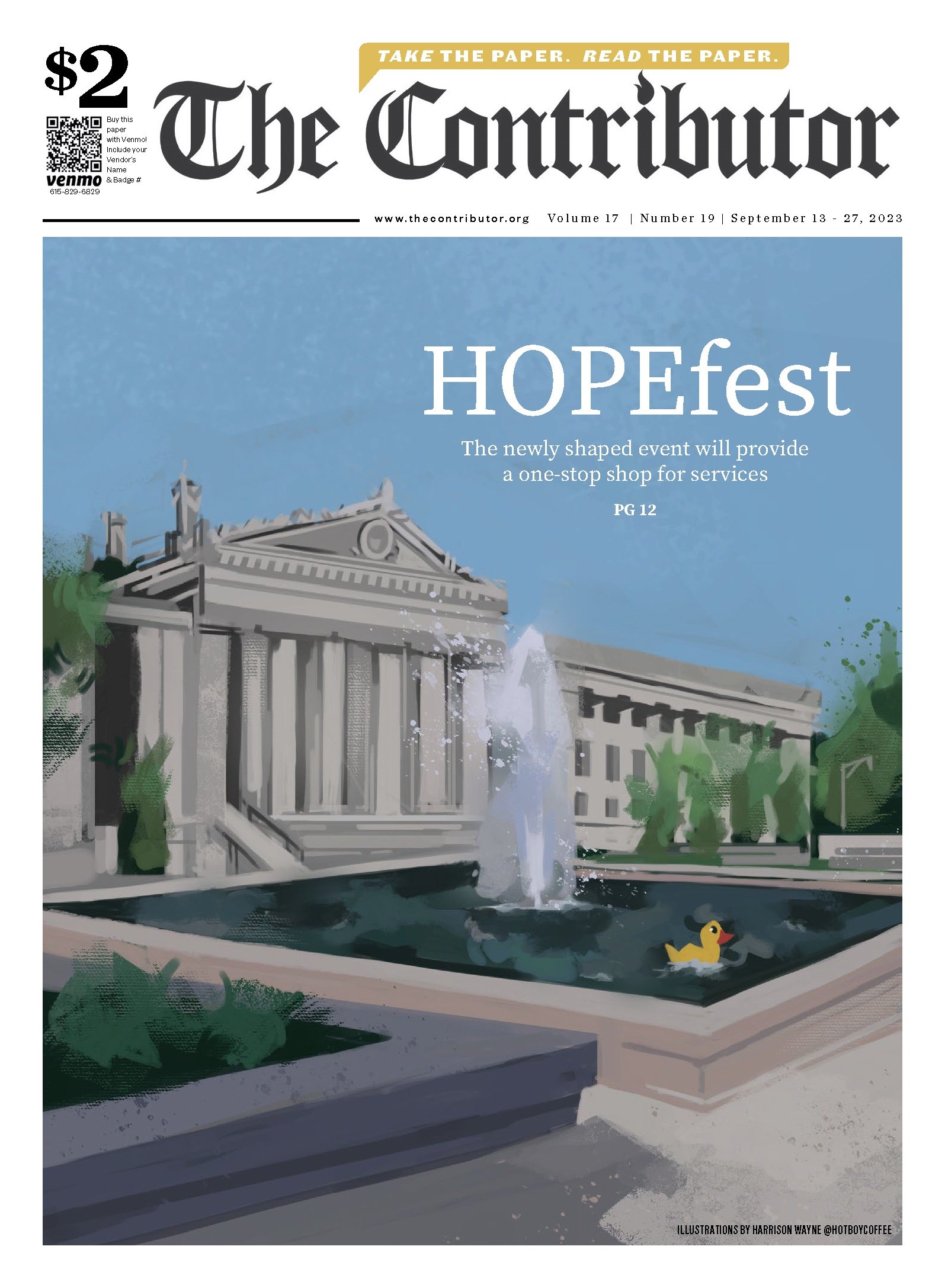
HOPEfest Issue (2023)
Poetry Issue (2024)
Wrapping Paper Issue (2023)
The Contributor
The Contributor is a Nashville-based nonprofit street paper that empowers houseless individuals by offering them the opportunity to work as independent vendors. Vendors are trained to sell newspapers, keep the income they earn, and reinvest by purchasing more papers to replenish their stock.


Summer Reading Issue (2024)


Loosing Legends Issue (2020)

Each year at Christmas, The Contributor collaborates with artists and vendors to design unique wrapping paper for a special holiday edition. These pages can be torn out of the newspaper and used as functional gift wrap. This particular design playfully contrasts classic Christmas symbols with the often overlooked yet ever- present pigeon, adding a touch of whimsy to the festive paper.


The initial concept involved an era-appropriate white dress hung on a shotgun, creating a contrast between the innocence of the dress and the menacing presence of the weapon. Various compositions and color palettes were workshopped, resulting in a final illustration that adopted a darker tonal direction to enhance the contrast with the dress and reflect the metaphorical turmoil in Hemingway’s mind.The final illustration was created with Adobe Photoshop CC and a Wacom Cintiq. The final cover design, text layout and printing completed by Brain Power’s creative director.


Brain Power
BANG! I Shoot Fweetee Playbill Illustration
Brain Power, a learning enrichment program based in Toronto, Canada, commissioned illustrations for an in-house produced and performed play. The project, titled ‘Bang: I Shot Fweetee,’ is written and directed by Joel Benanu and explores the life of Ernest Hemingway. Based on true events, it depicts Hemingway as a child forced to dress in female clothing, while also addressing his untimely death by shotgun, similar to that of his father and brother.


Brain Power
Toronto Transit Commission Ad Campaign
Guided by Brain Power's creative director, the initial concept featured a young girl peeling back a gray wall to unveil a vibrant display of academia-inspired symbols, drawing inspiration from Banksy’s Pull Back the Curtain. Several concepts were explored before beginning the final illustration, including various approaches to the graffiti’s visual style and meticulous refinement of the student’s body language to convey curiosity and excitement about continued education.
This collaboration was a masterclass in seamlessly integrating creative vision and technical precision, resulting in a visually impactful campaign.
Following the success of a previous collaboration, Brain Power reached out for work on developing and designing an advertising campaign for the Toronto Transit Commission.
The project required the creation of a central illustration, which needed to be delivered as four print-ready files adhering to the Toronto Transit Commission's specifications. The largest print measuring 12 feet in length.

The final proscenium and tattered curtain illustration was used across many posters, as social media banners. and merchandise distributed at the events. Small additional images were created for specific events, such as the Cato portrait, brown paper bag, and maple leaf image pictured.


Northwestern University
‘On Decolonizing Theatre’ Season Programming
Knowing where to begin translating ‘decolonizing theatre’ into a visual language was not an easy starting point. The concepts initially leaned towards various colonial imagery, such as a pith helmet, or a classic theatre stage foot lamp. Most concepts ended up featuring a theatre curtain, and the general design theme was taken in that direction. These thumbnails explore various fabric movements and color options in relation to the text, including green (the traditional curtain color of the colonial era, red (the more commonly recognized modern color, and purple, (symbolizing royalty and black liberation).
The client expressed the most interest in a thumbnail featuring a purple curtain stained with spray paint. This design Intentionally contrasts the elegance of 18th-century theatre with the modernity of graffiti, highlighting graffiti’s connection to black culture. The use of red was specifically chosen to symbolize the violence associated with colonization.


